Bar graphs
Bar graphs, so these things are often found in businesses or surveys, they show the majority of people who prefer something. Bar graphs are useful in collecting data here are the examples down below.
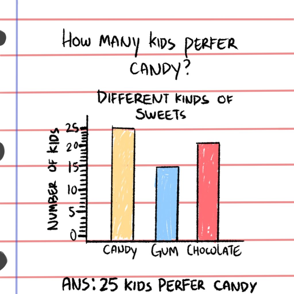
So the graph below shows 3 different kinds of sweets and the y axis shows the numbers of how many kids like each type of sweets and the x axis shows the variety of the sweets. Here’s a question how many kids prefer candy than gum?
answer: Ten more kids prefer candy than gum.
Now there are a lot of businesses who like to mislead you into thinking their companies are better when it actually isn’t so they rely on making the graphs into an illusion. Look at the example below, on the left bar graph the widths are very much different it may lead you to think that singing is more popular, but actually it’s basketball which is more popular. This is why we need to be smart and diligent when looking at the graphs, that is all thank you!
